Predicting Wealth in New York City from FourSquare Check-ins
Motivation
In marketing and advertising, an understanding of local demographics allows enterprises to better cater their products and services towards the individuals who live there. In the academic world, social scientists might be interested in understanding how people in cities react to ever-changing businesses, perhaps towards the study of gentrification. Across many domains, it’s helpful to understand the dynamics between businesses and the people affected by them. However, relying on costly and infrequent government census services to provide demographic information for large, changing cities quickly becomes unfeasible.
Dan Yu and I were curious about how location-based social media might help us address this problem. Many companies (think Yelp, Twitter, Foursquare) have real-time data about user check-ins, preferences, and their local businesses. So, we attempted to compile our own dataset based on FourSquare check-in data along with census data for New York City census tracts. With this new dataset, we did quite a bit of exploration to manually construct features and apply model wealth as a function of those features.
And it worked! We’d love to walk you through our process here, but ultimately, it’s our hope that others can build on our work with different models and features for other demographics.
Datasets
To address our problem of interest, we draw from two separate data sources:
- NYC Census Data: demographic data for 2,167 census tracts in New York City based on 2015 American Community Survey 5-year estimates. [1]
Sample NYC Census Data
- FourSquare Check-in Data in NYC: 227,428 check-ins collected from 12 April 2012 to 16 February 2013. [2]
You might have noticed that the check-in dataset does not map each event to a New York census tract. To join the census and check-in data, we map the latitude/longitude coordinate of each check-in to a census tract, using the FCC’s Census Block Conversions API. (This took nearly 24 hours, due to CPU constraints and API rate-limiting). [conversion code]
Problem statement
Our original motivation was broad — understanding “demographics” can mean a number of things, so we decided to constrain the problem to wealth, and more specifically, to median household income. For evaluation purposes, we need to structure our problem even more, so we split the data into quartiles, 4 balanced classes that could be used for prediction: 0–25% (poorest), 25–50%, 50–75%, and 75–100% (wealthiest).
At this point, we have a clear classification task: for each census tract, predict median household income quartiles.
Feature engineering
This part of the process opens the door for some creativity and exploration. In our approach, we built features based on assumptions about the characteristics of activity surrounding different types of businesses at different times. [feature eng. notebook]
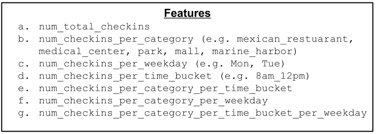
If we assume that high amounts of activity are positively correlated with higher
income (Fig. 1a), num_total_checkins for a given census tract might be
representative of a region’s wealth. Similarly, one might assume that
frequencies of check-ins at different types of businesses (Fig. 1b) — *think
cupcake shops vs. fast food restaurants — might hold different signals for
wealth. Given the timestamps of each check-in, we can also associate activity
during different days of the week (Fig. 1c) or times of the day (Fig. 1d*),
say 4am to 8am vs. 8am to noon, with different levels of wealth.
What if people who visit coffee shops from 4am to 8am are also correlated with wealth? We can do that! By engineering composite features that take advantage of both categories and timing (Fig. 1e, f, g), we can capture more complex relationships in our features.
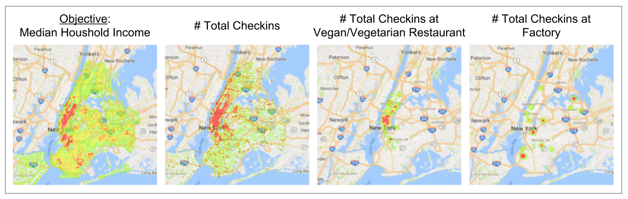
Finally, we can validate some of these assumptions by visualizing our data with heatmaps. Here, we plotted heatmaps (higher intensity for higher frequency) of checkins for our features, compared to our objective (Fig. 3). [visualization notebook]
After devising a method to extract each of these features, we can begin to
experiment with different sets of features to model the relationship between a
census tract’s check-ins and wealth. To do this, we compare different subsets of
the features that we just extracted (from Fig. 1) by evaluating them with k-fold
(k=5) cross-validation using a simple Naive Bayes model (Fig. 3).
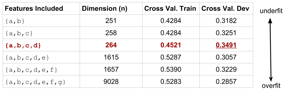
With too few features, our model doesn’t properly capture the relationship between check-ins and wealth. When we have too many complex and sparse features, we can fit our train set well but fail to generalize on the dev set, following our understanding of the Curse of Dimensionality.
Model Evaluation
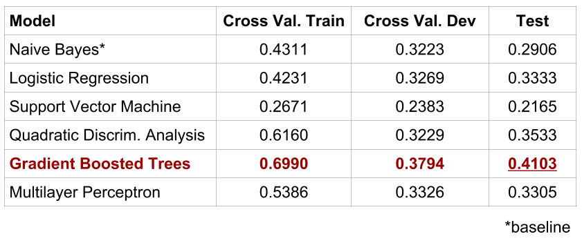
After choosing our feature set, we can proceed with experimentation using different models. We use a Naive Bayes model’s results as a baseline for evaluation, keeping in mind that random chance (with four possible labels) would produce classification accuracies of 0.25. For experimental hygiene, we split the data into 6 folds, reserving the 6th fold as a test set and using the first 5 folds for cross validation. In Fig 4., we’ve shared some of the results from some of the models that we fit to model the data.
After basic tuning for regularization, our best model, featuring gradient-boosted trees, achieved classification accuracy of ~40%, a lift of 15% above chance. Gradient boosting methods learn non-linear decision boundaries robustly, and there are a number of resources that expand on their effectiveness. (We discuss some of the other models in our full paper.)
Interpreting Results
Beyond a single classification accuracy, how can we interpret how well our model performed?
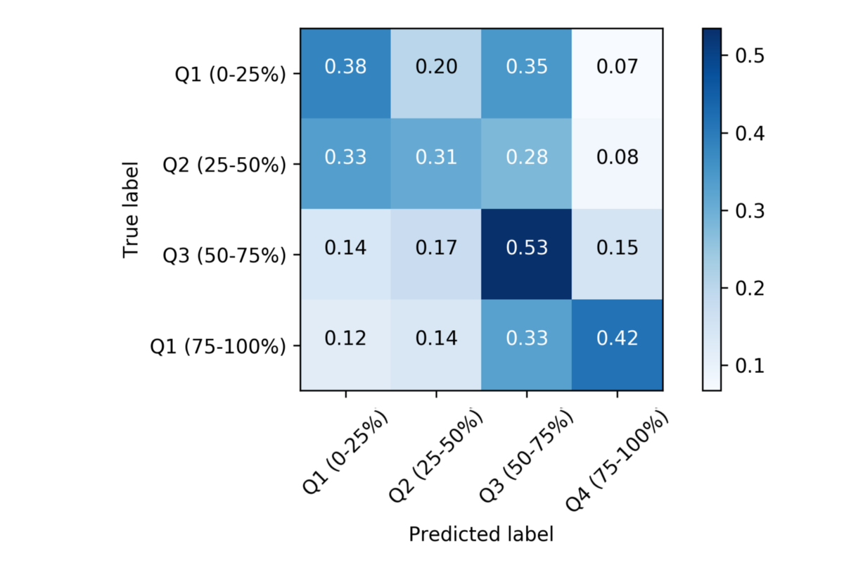
Fig. 5 shows confusion matrix for our best model. We see darker squares for Q3 and Q4 (bottom-right), compared to Q1 and Q2 (top-left), which means that we did a better job predicting high-income than low-income. We hypothesize that this is because we have more data from people who 1) have access to smartphones and 2) use apps like FourSquare to check-in to businesses, and we’re willing to bet that people who fulfill that criteria are wealthier than those who do not. In other words, *because our dataset might be derived largely from people of a specific demographic, we are more likely to have predictive signal for those classes of people. [model evaluation notebook]
Feature Analysis
Given our promising results, we assumed that our features held signal for wealth in New York City. However, a single accuracy number doesn’t tell us much about how people in cities actually interact.
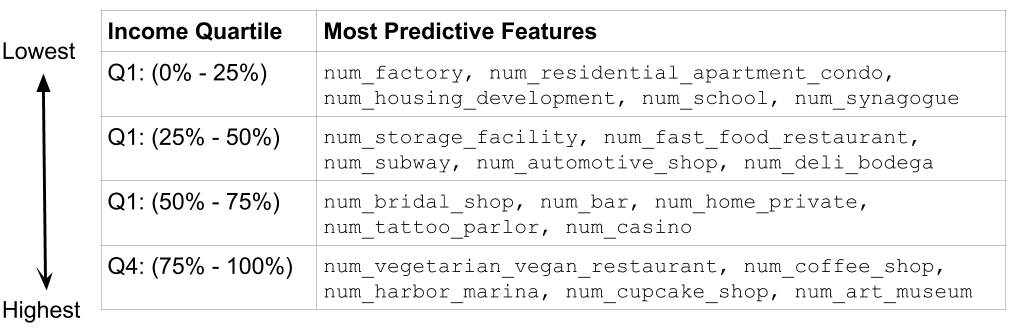
To interpret the features that contributed to regions with more or less wealth, we trained a sparse logistic regression model with an L1 penalty, which assigns a weight to each of these features. Then, we sorted the features based from highest to lowest weights. As a result, highly-weighted features at the front of our list were indicators for high income whereas lowly-weighted features were indicators for low income, as seen in Fig. 6.
How do we interpret this?
Well, based on the feature weights that the logistic regression model learned, check-ins at vegetarian/vegan restaurants coffee shops are correlated with high income, whereas check-ins at factories and housing developments are more predictive of lower income. In other words, our model has determined a correlation between the frequency at which people visit vegan restaurants, and the wealth of the surrounding neighborhood. [feature analysis notebook]
Takeaways
Explaining the final product doesn’t seem to do the process justice. There were many obstacles and a lot of learning in attempting to devise a new task based on an open-ended research question. Here’s an attempt to capture some learnings that we used to address ambiguity:
- Simplify the problem so that your progress is interpretable. Initially, we attempted to solve a regression problem for median household income. It was hard to evaluate the effectiveness of our models by interpreting MSE, so we simplified the problem to a classification task, in which we knew what abysmal performance looked like (below random chance).
- Sanity check your data. We actually began attempting to solve our motivating questions using the dataset of all Legally Operating Businesses in NYC. We attempted the same kind of feature extraction using business categories, but couldn’t seem to capture any meaningful relationships in the data. It became clear that the data wasn’t promising.
- Visualize the data. This is a corollary to the last point. To better understand your data, visualize it! We used the heatmaps (Fig. 2) to understand if there really existed correlations in the data.
- Feature engineering is the hard part. Even though this was hardly “real-world” problem — we augmented two sanitized datasets — most of our work was involved extracting meaningful features from the data. Our biggest improvements came from hitting the sweetspots for features (see under/overfitting in Fig. 3), as opposed to selecting/tuning our models.
Future work (aka your contribution!)
- Feature engineering: We’d like to emphasize that most of our largest gains were due to better features, and there is more we can do to further explore better combinations of features to model the data without increasing complexity by too much.
- Reducing bias/overfitting: There’s room to play around with the modeling, especially to reduce some of the bias of our models. As you can see in Fig. 4, there is a gap between the train and dev accuracies, which means that our data has high bias. Some ideas to improve this: trying new features and tuning more regularization parameters.
- Regression analysis: Given that we’ve validated our general approach with the simplified classification task, we flesh out a regression approach to attempt to predict income values directly for each census tract.
- Beyond Income: We can also expand the task of income prediction to other demographics. For instance, if you were to predict the distribution of ethnicities, you might use an approach that models the data using multinomial logistic regression.
We’re excited to have opened the door to a new data science task, and we’re looking forward to feedback and ideas for new approaches!
All of our code is here, and a more comprehensive writeup can be found here.
Special thanks to Qijia Jiang for feedback on our experimental approach and to Niharika Bedekar for reading drafts of this post.
If you have any questions, suggestions, or fixes, please don’t hesitate to contact us! My email is [vincentsc at cs dot stanford dot edu], or you can find me on Twitter as @VincentSunnChen. Dan’s email is [dxyu at stanford dot edu] and his personal site is http://danyu.me/.
Appendix
[1] Retrieved from : https://www.kaggle.com/chetanism/foursquare-nyc-and-tokyo-checkin-dataset/. Originally, https://sites.google.com/site/yangdingqi/home/foursquare-dataset.
[2] Retrieved from Kaggle: https://www.kaggle.com/muonneutrino/new-york-city-census-data/. Originally, http://factfinder2.census.gov (United States Census Bureau / American FactFinder).